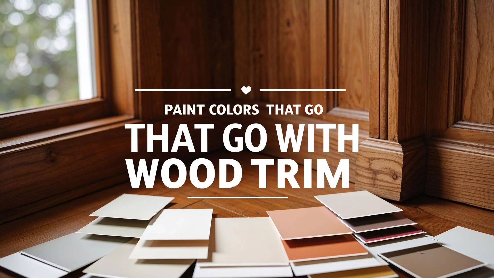
Looking for paint colors that go with wood trim? As an expert in home interiors, I’ve helped dozens of homeowners balance wood finishes with modern paint schemes. This is your honest guide to selecting wall colors that highlight and complement wood trim—without clashing or looking outdated.
Whether you’re dealing with rich mahogany, warm oak, or lighter maple, the right paint can make your trim pop or subtly support the space’s vibe. Let’s jump into 10 of the best options—and how to make each one work for your home.
| Paint Color | Best Wood Trim Match | Recommended Room Style | Styling Notes |
|---|---|---|---|
| Ultra White | Dark Walnut, Mahogany | Modern, Craftsman | High contrast, brightens the room |
| Sage Green | Cherry, Red Oak | Rustic, Cottage | Natural balance, earthy feel |
| Mushroom Beige | Medium Oak | Transitional, Classic | Soft warmth, blends well |
| Soft Beige (Monochrome) | Light Maple, Pine | Minimalist, Small Rooms | Seamless, clean aesthetic |
| Navy Blue | Maple, Birch | Home Office, Den | Moody and bold, highlights trim |
| Dusty Rose | Oak, Cherry | Vintage, Bedroom | Warm and nostalgic tone |
| Filtered Gray | Dark Espresso | Hallways, Modern Homes | Clean contrast, cool neutrality |
| Sparkling Sage | Natural Wood Cabinets | Kitchen, Breakfast Nook | Fresh, subtle color option |
| Khaki | Mixed Wood Tones | Living Room, Family Room | Timeless and balanced |
| Charcoal | Light Maple, Ash | Modern Bedroom, Loft | High contrast, bold atmosphere |
1. Create Bold Contrast with Crisp Ultra White 🖼️
Highlight wood trim by pairing it with clean, white walls

A fresh ultra white wall color creates a clear, intentional contrast with dark woods like walnut or cherry. It lets the trim become a visual anchor while keeping the room feeling bright and clean.
- Why it works: White emphasizes natural wood grain without dulling it.
- Best for: Craftsman homes, heritage properties, or modern farmhouse styles.
- Styling tip: Use matte finishes for walls and semi-gloss on trim for depth.
- ❗ Potential downside: Can feel too stark in north-facing rooms with low light.
Pro tip: Use the same undertone (warm or cool) in both the trim and white wall paint for a cohesive look.
2. Use Earthy Sage Green for Natural Harmony 🌿
Complement red or orange wood undertones with calming green
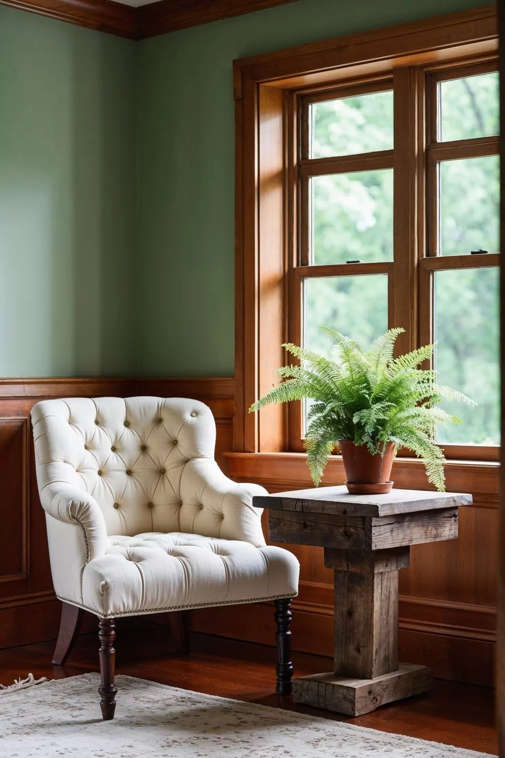
Sage or muted olive tones pair beautifully with warm wood. These colors create a soft, organic feel that brings out the richness in oak or cherry trim without competing.
- Why it works: Green sits opposite red on the color wheel, creating balance.
- Best for: Rustic homes, nature-inspired spaces, or vintage styles.
- Styling tip: Use natural fiber rugs and leafy plants to tie it all together.
❗ Heads up: Avoid too much green in small, dark rooms—it can read heavy.
3. Add Warmth with Rich Mushroom Beige 🍂
Blend instead of contrast with warm, neutral tones

Mushroom, greige, or soft taupe colors offer a subtle backdrop that lets wood trim shine without overwhelming the space. These tones work great when you want the trim to feel integrated.
- Why it works: Warm neutrals reflect the warmth of the wood without competing.
- Best for: Transitional interiors, open floor plans, and minimalist rooms.
- Styling tip: Layer different textures—linen, wood, and brass—for visual interest.
- ❗ Not ideal for: Rooms with little natural light, as it can look muddy.
“Mushroom tones feel timeless and make the space feel curated but not over-designed.” — Brad Smith, Omni Home Ideas
4. Go Monochromatic for a Clean, Unified Look 🎨
Use the same tone for both walls and trim

Painting the trim and walls the same or similar color makes a room feel larger and more modern. This works especially well with mid- to light-toned wood trim and soft neutrals.
- Why it works: Eliminates visual breaks and creates a continuous flow.
- Best for: Small rooms, minimalist interiors, and open-plan spaces.
- Step-by-step:
- Choose a warm neutral that’s close to your trim’s tone.
- Use eggshell finish on walls and satin on trim for subtle contrast.
- Add contrast with furniture and artwork.
❗ Drawback: May downplay the trim’s character if it’s highly detailed.
5. Try Navy Blue for a Sophisticated Edge 🛋️
Add depth and drama to lighter wood trim
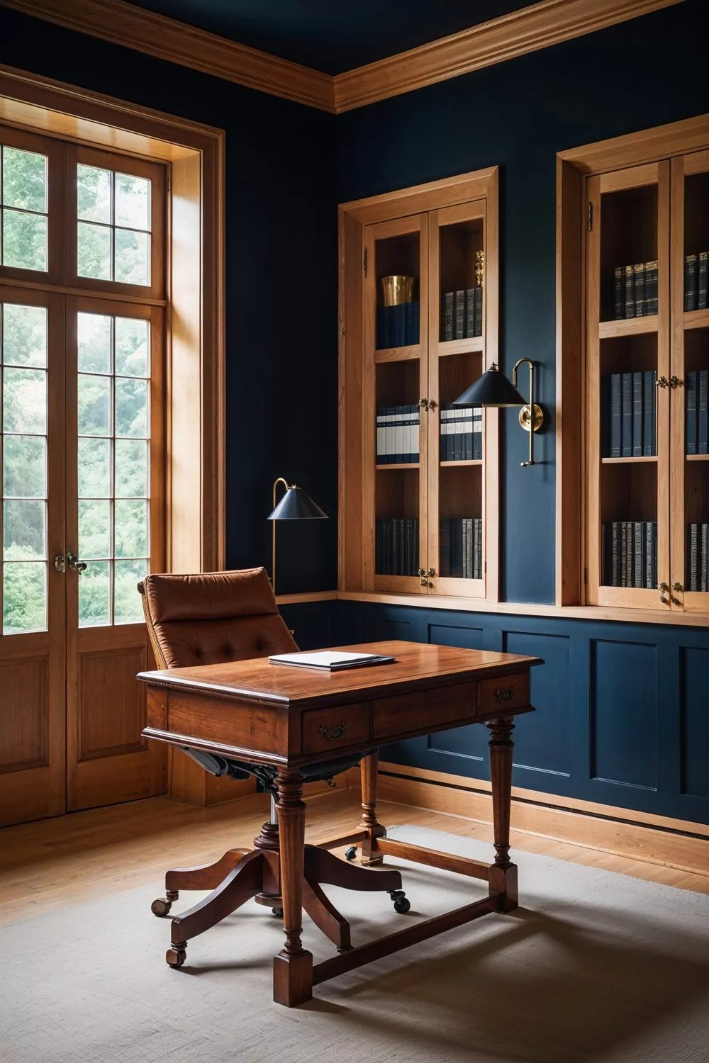
Navy blue walls make honey oak or maple trim stand out with intention. This pairing creates a cozy, grounded feeling while giving the space a modern twist.
- Why it works: Blue brings out the golden warmth in lighter woods.
- Best for: Offices, dens, dining rooms, or bold entryways.
- Styling tip: Pair with brass or gold accents for a polished finish.
❗ Caution: Can make small rooms feel even smaller—use with ample lighting.
6. Use Dusty Rose or Terracotta for a Cozy Glow 🌸
Play off warm wood tones with complementary reddish hues
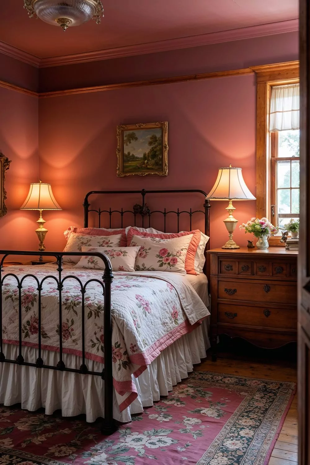
Muted pinks, terra cottas, or clay shades can highlight wood’s natural red or orange undertones, making the room feel warm and comforting.
- Why it works: These shades echo the wood’s richness and create a nostalgic vibe.
- Best for: Bedrooms, libraries, or vintage-inspired spaces.
- Styling tip: Use antique gold hardware and soft lighting for maximum charm.
❗ Limit usage: Might feel overly retro if not balanced with modern furnishings.
7. Apply Filtered Gray for a Modern Contrast 🧊
Bring a sleek update to traditional wood trim
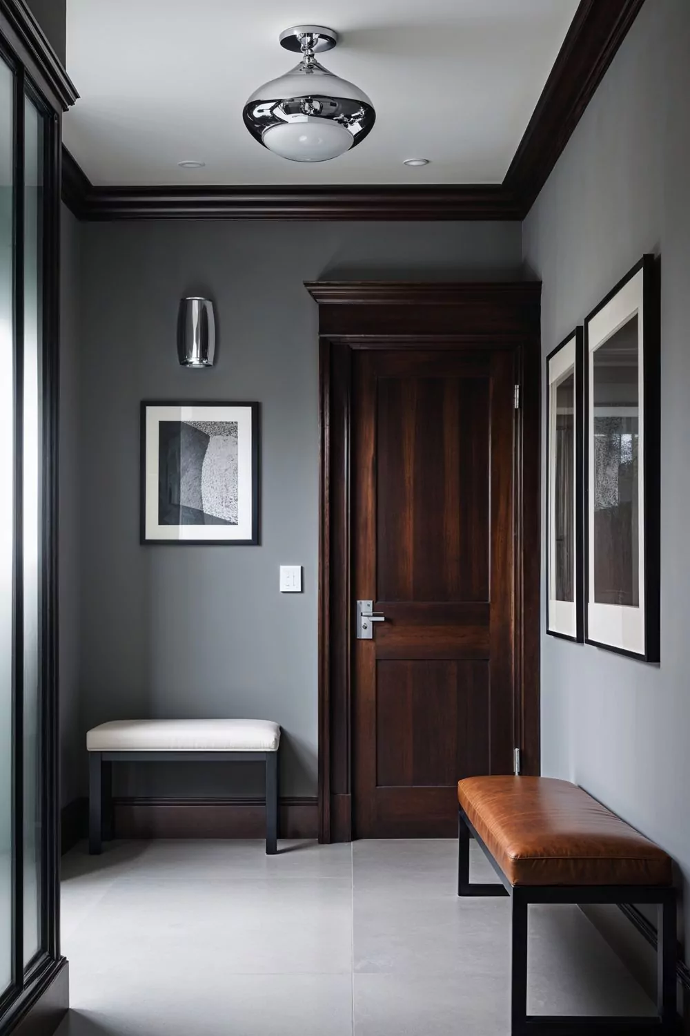
A cool, light gray like Valspar’s Filtered Shade contrasts warmly toned trim, especially in older homes. It creates a clean but not cold backdrop.
- Why it works: Gray neutralizes red/orange wood tones without clashing.
- Best for: Living rooms, hallways, and any space that needs a fresh update.
- Styling tip: Combine with matte black fixtures for a contemporary finish.
❗ Watch out: Cooler grays can make warm woods feel slightly dated if not styled correctly.
8. Use Sparkling Sage for a Trendy, Soft Look 🫒
Bring in just enough color while keeping it neutral

This green-gray hybrid works beautifully in bedrooms or kitchens where you want color but still need neutrality. It’s modern, fresh, and goes great with both light and dark woods.
- Why it works: It’s subtle enough to feel neutral, but still brings personality.
- Best for: Kitchens with butcher block counters or built-in wood shelving.
- Styling tip: Add creamy whites and natural textures for a soft contrast.
❗ Small risk: May look flat in artificial lighting—test first!
9. Choose Khaki for a Balanced, Timeless Finish 👖
Bridge the gap between traditional wood and modern color palettes

Khaki, sand, and wheat shades feel grounded and sophisticated. They won’t compete with your trim, but they’ll also keep things from feeling sterile.
- Why it works: Matches many wood tones and plays well with other accent colors.
- Best for: Family rooms, hallways, or homes with mixed wood finishes.
- Styling tip: Layer with navy or charcoal accessories for contrast.
❗ One note: Needs good lighting to avoid looking too flat or “builder beige.”
10. Bring in Charcoal for Bold and Moody Vibes 🖤
Contrast lighter trims with a strong wall color

Charcoal walls paired with maple or ash trim can completely transform a space into something elegant and modern. It’s bold but balanced.
- Why it works: The contrast highlights architectural details and makes trim pop.
- Best for: Bedrooms, media rooms, or modern lofts.
- Styling tip: Add oversized art and soft textiles to soften the look.
❗ Heads up: Might overwhelm small or dark rooms—use wisely.
Final Thoughts and Next Steps 🛠️
Wood trim doesn’t need to be painted over to feel current. With the right wall color, you can make your woodwork shine—whether you want contrast, harmony, or a modern twist.
Quick wins:
- Test undertones first—match warm with warm and cool with cool.
- Always sample in different lighting before committing.
- Combine matte walls with semi-gloss trim for visual depth.
If you’re still unsure which direction to take, grab a few paint samples and hold them against your trim in daylight and artificial light.

